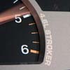
I personally like #7 the best. Shows the single most important part of the stroker engine, the crank,front and center and incorporates the piston in to it... but doesn't have too much extraneous items.
x2 on #7. Shows the crank, and incorporates the piston and rod assembly into the words. Im guessing #4 has only a bigger font than #1, so it also gets a thumbs up. You want people to be able to read it without tailgating. I like 7 the best.
Now I can be like all those other awesome people with more than one Jeep in their sig, but now I have to say one of them is sold:(
97 XJ 4.6
90 MJ 4.0 - sold
I want to have as many Jeeps as children. DD, offroader, drag MJ and another one. 4=4
I thing that if #5 had the piston turned and attached to the crank, and then made part of the "T" that might be cool.
I agree that #7 look more like a ear ring then a rod.
I realize that #7 doesn't have the crank in the pic..........which i thing is important............But 6 and 9 was the ones that jump out and grabbed me!!!
Flash
89 XJ with 300,000 on the original eng
"I've also never completed a motor, yet. My mouth (fingers) is also writing checks my ass can't cash."
I didn't vote yet, but agree with what Flash said with turning the piston/attaching the rod to the crank and incorporating it with the t in strokers on #5(why #7 looks good), but I'd want the gear around it like #6. From design 6's perspective, make the x into a t with the crankshaft horizontal and then 90 the rod onto the crank and make it smaller/scale to correct size of crank(but still will be a big t) and put it b/t the s and r.
gradon wrote:I didn't vote yet, but agree with what Flash said with turning the piston/attaching the rod to the crank and incorporating it with the t in strokers on #5(why #7 looks good), but I'd want the gear around it like #6. From design 6's perspective, make the x into a t with the crankshaft horizontal and then 90 the rod onto the crank and make it smaller/scale to correct size of crank(but still will be a big t) and put it b/t the s and r.
I thought about attaching the piston to the crank, but depending on which one you looked at the new 'T' would either be too big, or the piston would be just to small to be noticeable in others.
Maybe it's just me, but they all seem redundant. JeepStrokers/JeepStrokers.com...?
How about something a little more catchy? "I got Bored at JeepStrokers.com" "Ask me about my enhanced stroke! JeepStrokers.com" "It's the cubes that matter. JeepStrokers.com" "Build it bigger, build it better. JeepStrokers.com" "Yeah I Supersized it! JeepStrokers.com"
FrankZ wrote:Maybe it's just me, but they all seem redundant. JeepStrokers/JeepStrokers.com...?
How about something a little more catchy? "I got Bored at JeepStrokers.com" "Ask me about my enhanced stroke! JeepStrokers.com" "It's the cubes that matter. JeepStrokers.com" "Build it bigger, build it better. JeepStrokers.com" "Yeah I Supersized it! JeepStrokers.com"
Thanks very much for these suggestions.
I really like these ideas. Once we decide on which logo to go with, we may use one of these catchy sayings as long as that is ok with you.